
Wonder | LA Transportation System
Website | App | Tablet | Interaction Design
Wonder is a digital product that assists you to get around in Los Angeles with public transportation by providing easier and seamless way of reaching the User’s destinations and giving them options to discover.
Intro

Final Interface
About
Our Team wanted to design an App with IOS design guide line that seamlessly connects its users with the LA transportation system with unique features. With this APP, users can plan their schedule ahead, and be notified when desired ride arrives. It is optimized for the trans station, and its mission is to motivate users to utilize public transit with ease.
Our Vision
Brochures and papers are old school methods of navigating in a huge city like Los Angeles. Navigation and transportation systems can greatly benefit from current technology to replace the old.

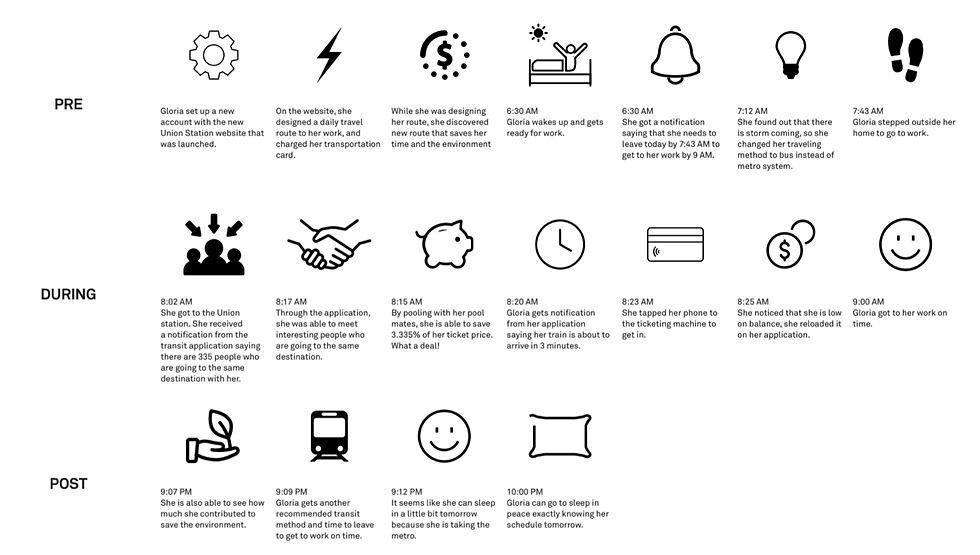
Persona


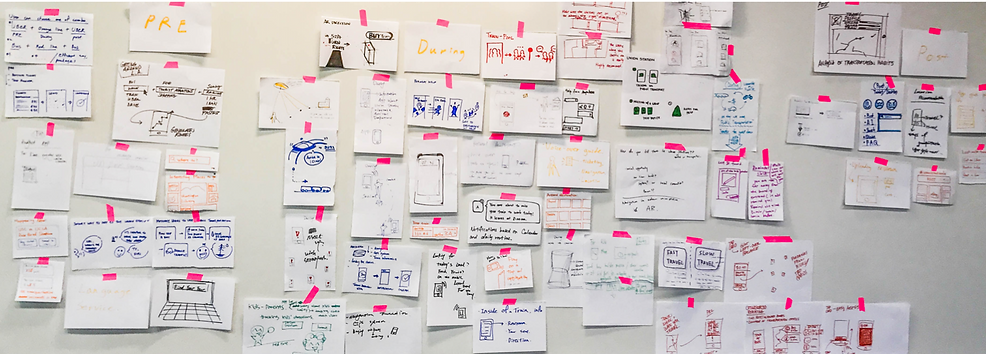
Journey Sketch


User's Mental Model / Brainstorm


Card Sorting
Our Team reached out 35 participants to do this card sorting activity in order to get a logic flow and more feedback from the users to further more develop our concept.

Patterns and Organizing from Card Sorting
-
Most of the participants were good at organizing the cards related to each categories. During the process of sorting, some participants seemed to be confused when organizing each routes and they needed explanations for a few cards.
Summarize Results
-
People were able to organize cards in order of planning the trip, going to the Union Station and then arriving at their final destination. Which are pre, during and post experience of their journey at Union Station.
-
People were more struggling with a sorting out the process of planning a trip while it seemed that process of finding the station and waiting for a train wasn’t much of a problem.
-
Some people categorize contents by experiences - going somewhere, discovering a interesting place, etc., others would start with types of information - public transportation status, service around, before-trip and on-trip related content.
-
Most of people would sort the card into the category called travel destination then start planning their trip by choosing transportation, way to get tickets.
Low Fidelity Wireframes
First step first, we explored the features that we decided to use
We wanted to focus on the layouts and what kind of contents would go on the product from predefined feature lists.

Pre Experience - Desktop
During Experience - Mobile

Post Experience - Tablet

Design Development


Medium Fidelity Wireframes
We went in to specific details to refine our work from previous fidelity. Certain contents have been updated, and features have been tweaked from previous sessions.

Pre Experience - Desktop
During Experience - Mobile

Post Experience - Tablet

User Testing


Prototype + User Testing + Summary of Insights
Wonder
Web: My user didn’t seem to understand that he can save his route for future reference. Also got feedback saying that it’s like Google Maps. But after talking to the user, he seems to have clarity of what the function of this is.
Mobile: He thought this did the same thing as the web version, which isn’t entirely. However, he liked the faster route idea...
Tablet: He later realized that he can save his route for the future use, which was the feature available throughout all the wireframes
Discover
Web: The overall structure is very clear, but the transitions of scrolling down needs more work. The idea of only the sidebar can be scrolled is very cool but if the right hand side picture can change a little big might be better.
Mobile: The landing page design is very interesting and being able to click on the logo that shows on the map is very attractive. For the bottom bar if it can also be slide sideways on the “walking distance” text panel to see different options or reminders.
Tablet: The icon displayed on the bottom makes it different from the web. Then for post experience, the review feature is very important, but what is missing is where and how the user can write and post their own comments.
Tap Card
Web: The user-testing participant easily understood the composition of the web, but suggested the need to classify some features (Rewards Program and My Coupons).
Mobile: My user was interested in the overall configuration. There was an opinion that it would be desirable to include the ability to add another card on the credit card information. It was necessary to install a navigation bar to guide user’s exploration.
Tablet: He was interested in the feature to check the usage data, but installing the navigation bar is needed.
High Fidelity Wireframes
Pre Experience - Desktop
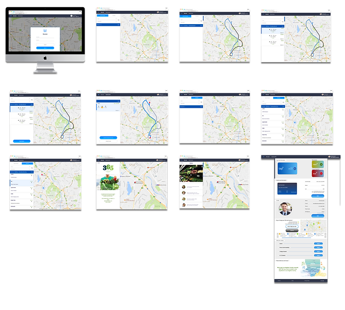
During Experience - Mobile

Post Experience - Tablet

Style Gudie

Information Architecture
Final Features


